Every once in a while you will come across a page that just doesn’t seem ‘right’. There are three elements of a website that can be harmed by bad practice:
Don’t say you haven’t been warned
Putting the 'happy' back into content
Every once in a while you will come across a page that just doesn’t seem ‘right’. There are three elements of a website that can be harmed by bad practice:
Don’t say you haven’t been warned
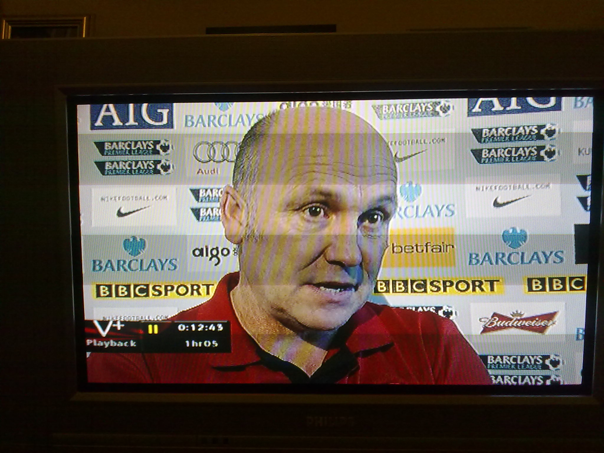 I was catching up with the weekend’s football last night and revelling in the enjoyment of the Manchester derby.
As Mike Phelan was being interviewed after the match, I took a proper look at the hoarding behind his head and was astounded.
I think we all know that the BBC’s policy on advertising has slipped a little in the past few years, but just how blatant is it on MoTD.
I looked closely at the screen (pic as you can see on the left) and realised there were none other than 7 different brands/companies being plugged. And that’s not forgetting the BBC Sport logo.
OK, so football is a different animal anyway because of the hoardings on the side of the pitch and on-shirt sponsorship, but the post-match interview is completely separate from that part of the game, isn’t it?
I get annoyed with the constant plugging of their own programmes in between other shows, but this is a step too far, surely.
